
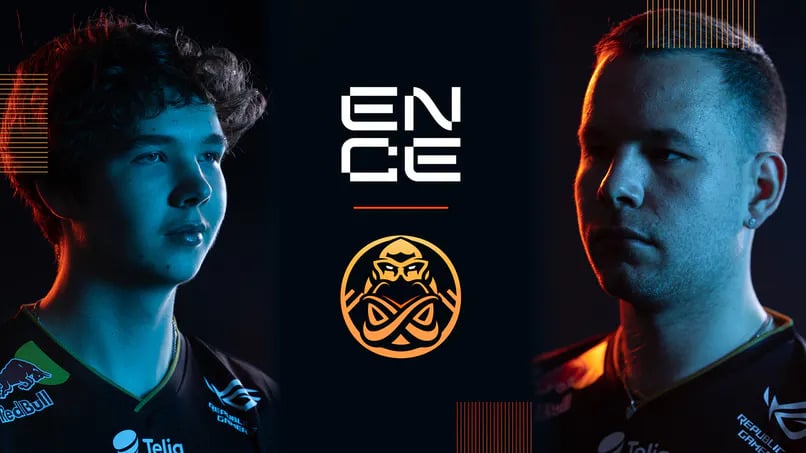
Finnish organisation ENCE has revisited its “visual universe,” updating its logo and wordmark in the process.
The logo has been refreshed in an effort to make it “more streamlined and simplified.”
RELATED: HellRaisers unveils rebranding with simplified logo design
As well as unveiling a simplified version of its logo and wordmark – both of which have been altered to “fit better our newly introduced visual universe” – the organisation relaunched its website and social channels.
Last month, ENCE entered a two-year partnership extension with Swedish telecommunications company Telia. The organisation is also partnered with Red Bull, Logitech G, ASUS, Wolt, noblechairs, Jimm’s, Bitfactor, and NitroCasino.
[primis_video widget=”5183″]
RELATED: London’s Platform gaming and esports bar reopens and rebrands
Joona “natu” Leppänen, Marketing Director at ENCE, spoke on the overall visual overhaul that the organisation has undertaken: “We have worked on this project for the better part of a year – interviewing fans and conducting many surveys to understand better how we can serve our followers better.
“What you see today is only the first stop in our process to further create digital services to make it easier for you to stay up to date on everything that happens here at ENCE. We have worked together with our partner Bitfactor to build this foundation of a whole new look to what ENCE is today and will be in the future.”
Esports Insider says: A rebrand isn’t a light task and it should only be done if you’re going to be better served by whatever the new iteration of your brand should be. ENCE’s new logo appears to simply be a more technically-sound version of the previous, which seems like a smart move to us.