
Yesterday on DreamHack Day, the global esports event and tournament organiser celebrated its 26th anniversary by announcing that it has rebranded with a new visual identity and brand portal highlighting its logo.
From its humble beginnings as a LAN-event in the basement of a Swedish elementary school, DreamHack has grown into a global gaming lifestyle entity, hosting events across the globe. Now with its rebranding, the organisation looks to build an identity ‘for the next 25 years’, according to DreamHack’s website.
Esports Insider spoke with Anna Nordlander, the COO of DreamHack and recent inductee into the Esports Insider Hall of Fame Class of 2020, about the newly unveiled rebrand.
“It was very important for us to stay true to our background.” Nordlander shared, “Subsequently, the refreshed brand really pays homage to our history and brings some very familiar elements into the future.”
According to DreamHack’s refreshed branding announcement page, the colours are designed to provide a link to the past with a ‘bright focus on the future’. Moreover, akin to what Nordlander says, the tournament organiser looked to maintain a traditional approach whilst also providing more variety to modernise its identity.
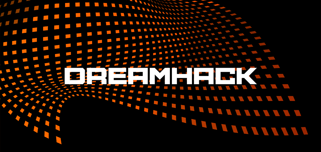
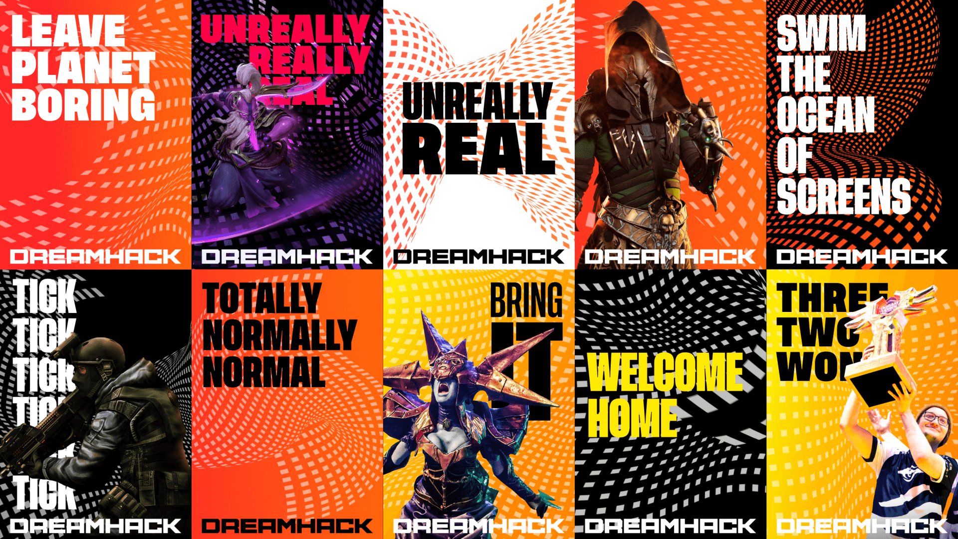
However, seeing is believing and DreamHack has immediately released assets to the public which highlight the brand’s new potential. This even includes expanding on its primarily black-and-orange stables with additions of a vibrant red, yellow, and white.
The organiser recently underwent a significant merger with sister company ESL under the larger ESL Gaming GmbH name this September, and last year ESL underwent a rebrand itself. When asked about if there is any correlation between these two rebrandings, Nordlander commented: “The DreamHack brand refresh was a process that started over a year ago.”
She continued: “Though partially inspired by ESL’s previous work with their updated brand it didn’t really have anything to do with the DreamHack and ESL merger.
“However, the timing for this brand refresh launch couldn’t have been more perfect as it shows the commitment that we at ESL Gaming have to the DreamHack brand both now and in the future.”
The reformatted wordmark maintains its iconic x-height, however, the firm has opted for more blocky letterforms, a DreamHack spokesperson explained that the letter counters being made square was to ‘create a visual representation of screens’.
RELATED: ESL Gaming Co-CEO Craig Levine breaks down the DreamHack merger
Nordlander referred to the newly launched DreamHack Brand Portal, which offers more of on insight and explanation into choices that went into the aesthetic intentions. The DreamHack Manifesto also highlighted that the new identity, as Nordlander commented that the rebranding “captures what DreamHack is, and always has been, to me and so many others.”
Within the Brand Portal are a myriad of assets to allow partners and ESL Gaming employees to express DreamHack’s branding in defined, yet playful ways, and most iconically, its core identity device, ‘The Warp’ – expressed within the portal as ‘pay[ing] homage to DreamHack’s heritage and represents the extraordinary things that happen when the gaming community gets together’.
The company also unveiled a DreamHack Drop-1′ apparel line, celebrating the updated branding and featuring an exclusive run of hoodies, limited and individually numbered to 360.
When asked whether the company’s rebranding had any representation of the changes happening with DreamHack, Nordlander expressed that “this brand refresh was certainly about giving DreamHack’s visual identity a well-needed update, but that’s not all.
“It has served as an opportunity for us to really define what DreamHack is and should be in the future. All parts together have landed us in what’s been revealed today which, together with the phrase ‘Where the gaming community comes to life,’ really does define the soul of DreamHack.”
Esports Insider says: Rebranding in 2020 is not a new occurrence with esports organisations EXCEL and Panda Global, among many others, developing new identities to enhance its appeal and fanbase to a global audience in 2021 and beyond. However, as Nordlander alluded to DreamHack’s new visual identity isn’t just about how the company looks, but how the firm wishes to portray itself as the esports ecosystem continues to develop.